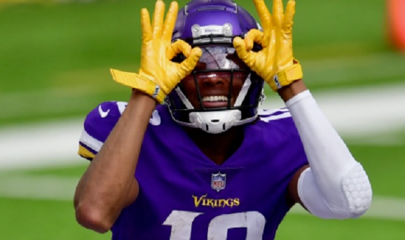
 Walt
WaltYou usually know you’re watching the NFL within a few seconds. The scoreboard graphics look familiar. The team colors are exactly what you expect. Camera angles stay tight on the line of scrimmage and pull wide at the right moments. Even the way the field is framed on screen feels deliberate. Before a snap or kickoff, the broadcast itself makes it clear you’re watching football at the highest level.
As football has moved further into digital spaces, the league’s look has followed. NFL-inspired visuals now appear across mobile apps, video games and social platforms, and sometimes in places you might not expect, including slots for real money online. These appearances are rarely obvious or dominant. They simply exist, quietly reinforcing how far the NFL’s visual language has spread.
So why does this presentation still hold up? Why does it continue to feel relevant when everything else in sports media seems to refresh itself every few years? The answer has less to do with chasing innovation and more to do with discipline. The NFL understands that familiarity, when used carefully, becomes a strength rather than a limitation.
The power of consistent NFL branding
The NFL does not rush branding decisions. Team colors remain stable for decades. Logos change slowly, if they change at all. Even uniform updates tend to feel like refinements rather than reinventions. That restraint is intentional.
Consistency teaches the audience what to expect. When certain fonts or layouts appear on screen, there is no pause to interpret them. You already know what they represent. That instant recognition keeps attention where it belongs, on the game instead of the presentation. There is also a trust factor at play. A league that looks confident and organized feels reliable. Fans may not consciously analyze branding choices, but they still react to them emotionally. Stability signals legitimacy, and the NFL has committed to that idea for a long time.
How game-day presentation shapes fan expectations
NFL broadcasts are built with care. Camera angles emphasize speed and physical contact. Replays slow key moments down just enough to let tension settle in. Graphics appear when they add meaning, not just decoration. If you watch closely, very little feels random. Over time, these choices shape how football is experienced. A third-down graphic shifts the mood immediately. A red zone visual tells you something important is about to happen. You react before you stop to think about why.
Because these cues repeat every week, they fade into the background. You stop noticing them consciously, but they still guide your reactions. That conditioning is a big reason NFL presentation feels authoritative, even when similar visual rhythms appear in other digital settings.
Why NFL imagery stays with you
NFL visuals are tied to memory in a way that is easy to overlook. Helmets, end zones, yard lines, and scoreboards are not just design elements. They are connected to moments. A late touchdown. A season-ending loss. A game watched with people who are no longer sitting next to you.
When similar imagery appears outside a live broadcast, your brain fills in the meaning without hesitation. You associate it with pressure, competition, and stakes. That response happens quickly and without effort.
This is why football visuals translate so well beyond the field. They do not need an explanation. The symbols already mean something to you, which gives them weight even when the game itself is not present.
NFL influence across digital platforms
As fan behavior has shifted, the NFL’s visual presence has shifted with it. Fantasy football apps borrow broadcast-style layouts because they feel intuitive. Football video games mirror real camera angles because they feel familiar. Social media graphics rely on recognizable fonts and colors because they signal credibility in crowded feeds.
That influence now extends into broader digital gaming spaces as well. Some platforms borrow football-style pacing, terminology, or visual cues simply because fans already understand them. Even casual gaming and slot-style environments are inspired by the NFL, using branded colors and even featuring top players and iconic logos. When something looks like the NFL you already know, trust comes faster. There is no learning curve. You engage without thinking about it.
When NFL visual cues appear outside football
Because NFL imagery is so recognizable, it occasionally appears far from traditional football settings. Football-style color palettes, motion graphics, and symbolic language show up across digital entertainment in subtle ways.
In these cases, the visuals are not trying to replace the sport. They act as familiar signals that borrow football’s emotional weight. Seeing NFL-inspired design in environments removed from the stadium reflects how deeply the league’s aesthetic has entered the broader digital culture.
The goal here is recognition, not persuasion. Designers understand that NFL visuals communicate stakes and excitement almost instantly, which makes them useful in more places than most people realize.
Why the NFL’s visual reach still matters
The NFL’s visual identity is one of its most durable assets. It allows the league to remain recognizable across platforms, devices and generations of fans. That consistency reinforces loyalty and keeps people emotionally invested, even when no games are being played.
In a media environment that constantly reinvents itself, the NFL stands out by staying familiar. You do not just watch the league. You recognize it, often without stopping to think about why. That recognition keeps the NFL at the center of sports culture. As football continues to evolve digitally, its visual identity ensures that no matter where you encounter it, it still feels unmistakably like the NFL.